3 Strategies We Use To Reduce HubSpot Development Time By at Least 50%

Contents
Do you know that a typical HubSpot site development project takes at least 30 days to complete?
A common HubSpot development project will have several phases such as:
- Project kick-off
- Content development
- Design iteration
- Development phase
- Revisions
- Launch
- Optimization
Out of the 7 phases above, which one do you think takes the most time to complete?
If your answer is development phase, you are right.
A single page development on HubSpot can take up to 20 hours, depending on the page's difficulty or complexity. Multiply it by the number of pages your site will have. If your site needs to have 7 pages, that means, it will take around 140 hours to build those pages.
That's over 3 working weeks! Crazy!
From the business' perspective, this workflow isn't efficient.
First, it takes too much time. We understand that quality comes first, but that doesn't mean the longer a project takes, the better the quality will be, right? Second, it takes too much capital. As a business, time is equal money.
What if you can at reduce your site project time by at least 50%?
Instead of 30 days, you'll be able to launch a brand new site in under 2 weeks. Is that even possible?
The answer is a big YES!
To reduce the project's timeframe significantly, we need to optimize the phase that takes the most amount of time. Which means, we have to optimize the development phase.
In this article, we'll cover the 3 strategies we always use that will save at least 50% of your HubSpot development time.
Table of Contents:
Ready? Let's start!
#1 CSS FRAMEWORK
Time saved: 50% of development time
 If you are familiar with big names such as Twitter's Bootstrap, Foundation, or UiKit. This method adopts the similar approach. But instead of using the infamous frameworks mentioned earlier, we'll create one for our own.
Before we dig in further, it's important to know HubSpot CMS (also known as HubSpot COS) uses Bootstrap 2 by default, and bad news is we cannot change it. If we include a separate framework, it will most likely cause conflicts.
That's why adding Bootstrap, Foundation, UiKit, or any other frameworks, is never a good idea, period.
Back to method #1..
The difference between this method and using the frameworks above is we will create a framework that will complement HubSpot CMS' framework.
Instead of overwriting, this framework will offer new options and features that will work seamlessly with HubSpot.
Sounds good?
The $1 Billion QUestion:
how do I create it?
If you are a non-developer, you will definitely need help from a developer or at least someone who can code in CSS.
Ready to start?
Let's start..
Step 1: List all appearance styles you'll need
Imagine a new section on your site. You can think of a two-column text, gallery, contact form, hero banner, anything.
What appearance styles would you like to apply to that section?
Appearance styles that we are referring to are the visible aspects visitors will see from the section. It can be paddings, margins, background color, text color, line height, basically anything visible.
Let's start with 4 examples:
- I would like to add a top and bottom spacing of 100px
- Add a background color (orange or #FF88000) to the section
- Turn the text to white
- Increase the margin between this section to the previous section by 50px
Step 2: Convert into CSS classes:
To apply these appearance styles, we need to create CSS classes that we can add to the section.
Using the 4 examples I listed above, I can come up with 4 CSS classes:
- padding-top-100 and padding-bottom-100
- background-orange
- text-white
- margin-top-50
NOTE: You should come up with ALL appearance styles you'll need to create a new section. The idea is to have a complete "directory" of usable CSS classes we can apply to any section without touching the CSS file at all.
Let's now build a CSS directory using the 4 examples above:
.padding-top-100 { padding-top: 100px; } .padding-bottom-100 { padding-bottom: 100px; } .background-orange { background:#ff9900 } .text-white { color: white; } .margin-top-50 { margin-top: 50px; }
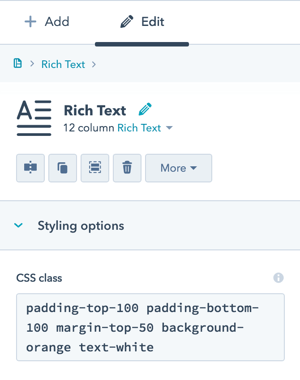
Once the CSS directory is up and running. You can start using them to craft sections fast. Here is an example:

Isn't that cool? No more section-specific CSS targeting.
Step 4: Create CSS class variations
If you follow the examples above, you'll have 5 CSS classes to start with. Now, why stop here and not create variations we can use later?
It may sound confusing, so let's start with an example. In Step 1, we created the following classes:
padding-top-100 and padding-bottom-100
Won't it be boring if the whole site has the same paddings for all section?
So why not create a huge padding variations from padding-top-10 to padding-top-200?
The more options you have, the faster it will be for you to develop a page in the future.
We also have:
background-orange
Why not also create background-blue, background-white, background-red, etc?
Get the idea? You can continue with the rest of your appearance styles.
If you follow the steps above, by now you should have a huge directory of ready-to-use CSS classes you can add to any template (as long it includes the CSS file you have).
Takeaways
I know it's an exhausting method at the beginning. But look at the long term.
Once you've set one up, you will not need to create another in years. You can use every CSS classes you have on any page you'll have.
We have used and still constantly using this strategy to build all of our client HubSpot sites and templates we sell in the HubSpot marketplace. In average, this method can save 50% - 60% of our development time.
#2 Purchase Templates
Time saved: 60% of development time
Do you know HubSpot has an active marketplace where you can purchase a template pack to kick-start your project immediately?
There are over 137 template packs that include ready-to-use landing page and site page templates.
However, I don't mean that EVERY template pack listed on the marketplace is worth to buy. Some templates may not function the way you expect them to be, and some may not be up to the development best practices.
Perks of using a template
The benefit of purchasing a template pack is you'll save 60% of your development time.
You may ask, why not 100% if they are ready to use?
They are ready to use, but we still must tweak them based on our design and layout needs. This also means you must learn how the developer built the templates, and how to edit or extend the templates.
If you choose the wrong template pack, then it will require an even longer learning curve.
Tips in choosing a template
So now it goes down to your expertise in choosing the right template or template packs for your need.
There are tons of variables to consider. Based on our experience, the most important ones are:
- Template's features
- Possibility to reuse or re-purpose elements on different pages
- CSS and JS structure and cleanliness
- Level of HubSpot CMS/COS expertise required
- Zero Console error
If you have time, you should schedule a call with the developer and ask for a live demo of the template's back-end. Be sure to address the variables above during the call so you'll get an overview of the templates.
Now... let's dig into Method #3, the best method that will save 70% of your time in creating new HubSpot pages.
#3 HubSpot Custom Modules
Time saved: 70% of development time.
Do you know HubSpot recently launched a whole new product category in the marketplace?
That's right, we now have a custom modules marketplace!
Why custom modules though? How can it save my development time?
It's simple.. With the new HubSpot COS/CMS, custom modules are now super powerful. We can develop any section (YES, any section you can think of) as a custom module.
Which also means... you can have a fully functional section you can add to any page by dragging and dropping it into the page editor. And it comes in a form of a custom module.

OK, I'm sold, how do I start?
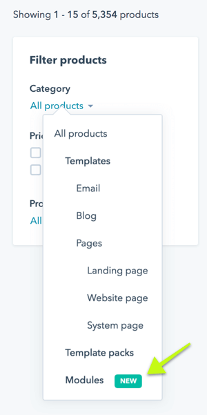
Open marketplace.hubspot.com
Filter products, and choose Modules.

There you have it.. A huge collection of HubSpot custom modules you can drag into any page you have on HubSpot.
But the same as templates, I cannot guarantee that every custom module in the marketplace is user-friendly. There may be some that may cause conflicts with your site. It's always better to contact the developer first before buying one.
Don't go yet!
I have an even better solution.
BONUS: #4 Ark MODULES Pack
Time saved: 90% of development time.
What if you can save 90% of your development time? Sounds impossible? It's totally possible!
And it's made possible by Ark.
Ark is a huge collection of 100+ HubSpot custom modules you can add to any HubSpot template you have (even a blank one). And we are launching 4 new Ark modules every month.
How does Ark module work?
Each Ark module works as a standalone section, it has its own CSS and JS and is not dependant on any site-specific asset files. This means you can add Ark modules to any HubSpot templates in your portal.

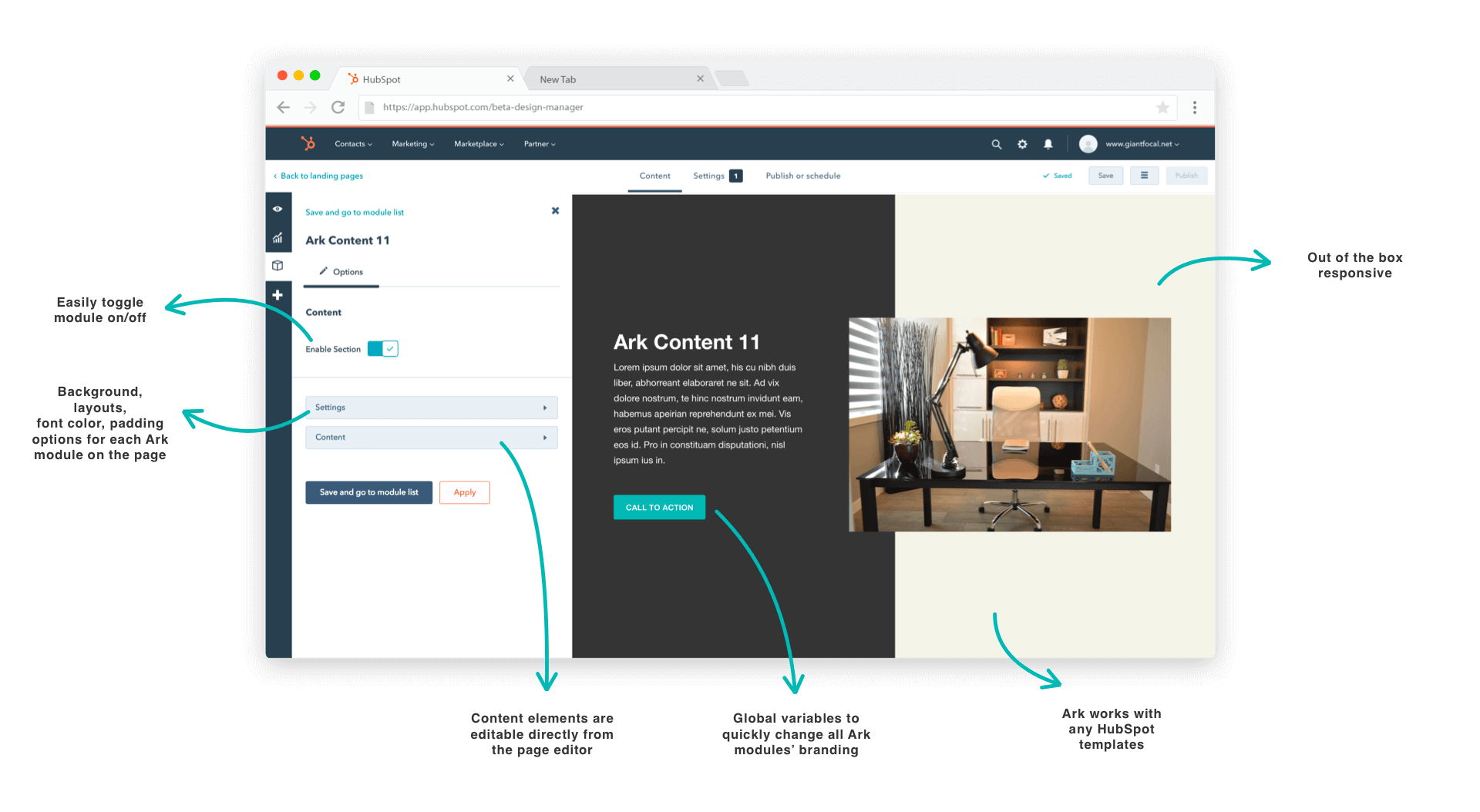
How does it look in the back-end?
If you have ever used a custom module, you can use Ark modules with ease. Ark is 100% built on HubSpot and for HubSpot.
Here is a preview of how it looks in the page editor:

So... what's the investment for Ark?
If you purchase an individual Ark module, each module will cost you $35. It's an easy decision considering how much time it can save you.
We all love deals, no?
If you purchase the whole Ark pack, it will only cost you $2,000. Which means each module will only cost you $20. That's crazy! But.. Is there any better deal?
Yes! As a launch promotion for Ark pack, we are giving 30 (yes only 30!) vouchers for a 80% discount. You'll get Ark, which includes 100+ HubSpot modules, for only $400!
If you are not ready to make this investment, we have 5 free Ark modules already launched in the HubSpot marketplace. To download them to your portal, click here.
Please download, test, and even launch them to your site. They are 100% FREE and fully supported by GiantFocal.
If you think Ark is the right solution for your business, contact us to get the 80% discount any time. Remember that we only have 30 vouchers right now.
