The Beginner's Guide to Adaptive Web Design

Contents

If you are working in the industry of web design and development, I'm 100% sure that you have been working intensively with the term responsive web design. You might already use responsive frameworks to build your websites, and joined countless discussions on the topic.
But today, a huge portion of the discussions are now shifting to the term adaptive web design.
What does the term really mean?
Is it a better "alternative"?
Well, good thing that we are going to answer your questions in this article.
What does adaptive web design entail?
Adaptive design is a contextually relevant experience because adaptive sites are created to suit various devices and operating systems.
Its development is complex and therefore more expensive, but it provides us the flexibility to target our personas based on the gadgets they are using to access our website.
Unlike responsive web design that mainly utilizes CSS media queries that are executed in the client, adaptive design is processed in the server.
Some designers focus on sites that will suit various screen sizes, browsers and operating systems; an adaptive web designer will create a site that has different versions up front in the form of templates. The server then distinguishes which device or operating system is being used and sends the correct version of the site to the device.
The differences between adaptive and responsive sites
The most notable difference between the two can be explained this way:
- In the case of a responsive site, the layout is deternined on the client’s side. All consumers receive the same file, but based on the user’s browser, parts of the file may be respositioned or hidden.
- In the case of an adaptive site, the layout is determined by the web server, and not the browser. The server identifies the device or operating system and sends the corresponding version of the file.
This specific feature is useful because some mobile phones are not able to read more complex sites. Upon detecting a low-end device, the server can automatically filter through only the least complicated content. This adaptation means that more mobile phone users have access to sites, albeit on slightly varied levels.
Much of what is different between adaptive and responsive sites is how the information is communicated to users as far as the HTML and CSS are concerned.
Garrett Goodman came up with a simple definition:
“Responsive design is client-side, meaning the whole page is delivered to the device browser (the client), and the browser then changes how the page appears in relation to the dimensions of the browser window.
“Adaptive design is server-side, meaning before the page is even delivered, the server (where the site is hosted) detects the attributes of the device, and loads a version of the site that is optimized for its dimensions and native features.”
Another way to describe the difference between the two would be to compare who does all the work:
- In adaptive sites, the server works in order to deliver the best version of the page to the device. Therefore an adaptive website downloads a little faster (or much faster in larger sites).
- In responsive sites, the device receives all of the data and then has to work at responding to the site.
When it comes to generating the sites, there are differences too.
Web designers use multiple templates for one website in adaptive design, whereas in responsive sites they use a single template with a flexible framework.
Ok cool, so how does it look in the real world?
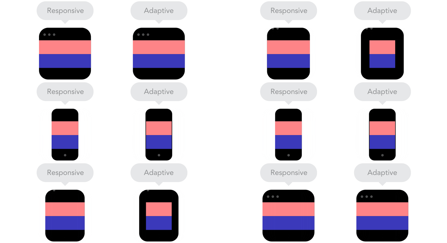
Here is an amazing gif created by FastcoDesign that explains how it simply works:

Notice how responsive web design mainly utilizes flexible container, while the adaptive web design utilizes specific width containers for specific devices.
A real-life example
Amazon is one of the leading companies that utilizes the adaptive design practice. Here is the homepage that we usually see on large screens.

And here is how it looks on mobile:

Notice how their mobile-version web is specially designed for better mobile experience?
How to find out if a website responsive or adaptive?
It's pretty east, you can start by resizing your browser; if its content container scales together with the browser's width, it's a responsive site.
On the other hand, if you resize your browser till it reaches a mobile phone's width (less than 767px or 650px), and the container doesn't scale down (site goes beyond the screen's width). But when you access the site on mobile, it has a totally different layout, it's an adaptive site.
Seven facts in favour of adaptive web sites
- Adaptive sites load faster and generally offer a better user experience.
This is due to the fact that the device only receives the specific data necessary for optimal functionality.
For example, browsers with older phones will not receive the same high resolution imagery as a user with a smartphone. - Adaptive sites can be designed to best suit the end user’s requirements.
A mobile user will interact differently with the site compared to a desktop user. The adaptive site can be tailor made to suit each device and each feature on the device can be optimized. An adaptive site will read features like ‘location’ and use this data to offer the client more information, if needed. For example, the location of the nearest store or outlet.
In essence this means that each user can enjoy a range of features that are custom designed for their device - An adaptive website can be designed using an already existing website. The original site, with all of the coding that has been added over time, need not be voided. This is a great feature as the website can be upgraded without the risk of losing costly and time consuming coding input.
- In the same way, if an existing adaptive website needs changes in the code, these changes can be made without affecting the whole site. Small tweaks and modifications can be made without the entire site being taken down.
For example, if a website has a glitch that is affecting mobile users, the desktop version will remain unaffected while the mobile site problem is being ironed out. Sounds great doesn't it? - Adaptive websites can be made accessible to all mobile users, even those who do not have smartphones. This is useful if the client wants to target developing markets.
Realities against adaptive web sites
- Adaptive websites are expensive as they take a team of developers.
- Although an adaptive website is a great approach, the complexity of creating so many separate designs takes a lot of work.
Is adaptive design right for you?
The type of web design you choose depends on two things; the needs of your specific project and the needs of the users you serve.
You should consider using adaptive design if:
- Device-specific design and experiences are a requirement for your website
- You have the ability/capability to design different experiences for various devices
- You have the resources to maintain the templates
- Analytics show that your user base is accessing your information through a variety of different means. You may want to create an adaptive interface so that your users can enjoy device-specific interaction with your site.
- You need an interactive, secure site that suits everyone who may visit your site using a variety of mobile devices or operating systems.
In conclusion
The reality is that websites are viewed on different devices and in different circumstances.
Your site needs to accommodate the diversity of your users; a satisfied user is more likely to return to your site and possibly recommend it or share it with others.
Quite possibly the initial investment of an adaptive website might be worth your while. Choosing between responsive and adaptive web design isn't an easy thing to do, you should take your time to brainstorm all of your needs and match it with the resources your business has.