We have created a reusable library of responsive padding CSS classes that we can apply to each module.
1. Formula
CSS class formula: p{t|r|b|l|x|y}-{size}
Side
First, we need to decide which sides to add padding.
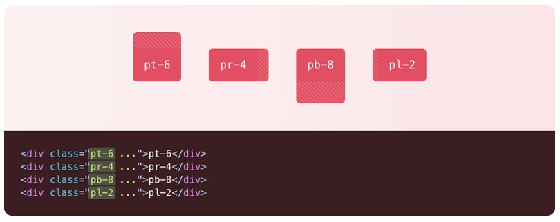
Each padding class can be applied to 7 possible sides:
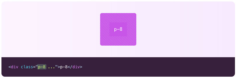
- p = padding all sides
- pt = padding top
- pb =padding bottom
- pl = padding left
- pr = padding right
- px = padding left and right
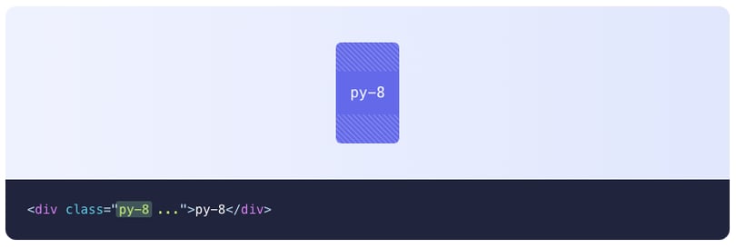
- py =padding top and bottom
Size
Padding sizes are in rem and are relative to the base font size. Calculation examples:
If the base font size of 16px:
- 1rem equals 16px
- 0.5rem equals 8px
- 2rem equals 32px
- 3rem equals 48px
Available sizes:
| Size | Size in rem |
| 0 | 0 |
| 0.5 | 0.125rem |
| 1 | 0.25rem |
| 1.5 | 0.375rem |
| 2 | 0.5rem |
| 2.5 | 0.625re |
| 3 | 0.75rem |
| 3.5 | 0.875rem |
| 4 | 1rem |
| 5 | 1.25rem |
| 6 | 1.5rem |
| 7 | 1.75rem |
| 8 | 2rem |
| 9 | 2.25rem |
| 10 | 2.5rem |
| 11 | 2.75rem |
| 12 | 3rem |
| 14 | 3.5rem |
| 16 | 4rem |
| 20 | 5rem |
| 24 | 6rem |
| 28 | 7rem |
| 32 | 8rem |
| 36 | 9rem |
| 40 | 10rem |
| 44 | 11rem |
| 48 | 12rem |
| 52 | 13rem |
| 56 | 14rem |
| 60 | 15rem |
| 64 | 16rem |
| 72 | 18rem |
| 80 | 20rem |
| 96 | 24rem |
2. Examples
Add padding to a single side
CSS class formula: p{t|r|b|l}-{size}

Add horizontal padding
CSS class formula: px-{size}

Add vertical padding
CSS class formula: py-{size}

Add padding to all sides
CSS class formula: p-{size}

3. Responsive
Pre-built padding CSS classes also come with responsive breakpoints. This means we can assign custom padding(s) on mobile, tablet, and desktop.
To activate a specific breakpoint, add the following prefix in front of the padding CSS class you've chosen:
- mb: for mobile
- tb: for tablet
- ds: for desktop
Examples:
- mb:pt-4 ds:pt-8
Assigns padding-top of 1rem on mobile and 2rem on desktop - p-4 mb:p-2
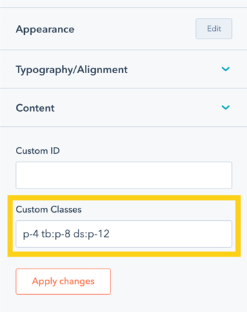
Assigns a padding (all sides) of 1rem in all breakpoints, but turn into 0.5rem on mobile - pt-4 tb:pt-8 ds:pt-12
Assigns a padding-top of 1rem in all breakpoints, 2rem in tablet, and 3rem in desktop.
4. Usage
Add your own padding CSS classes into the Custom Classes field that's available in each Hatch module.

Source: Images are from Tailwind