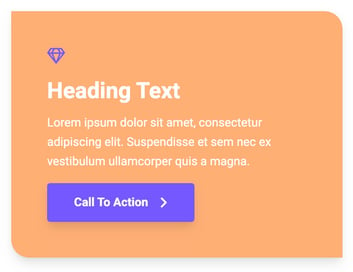
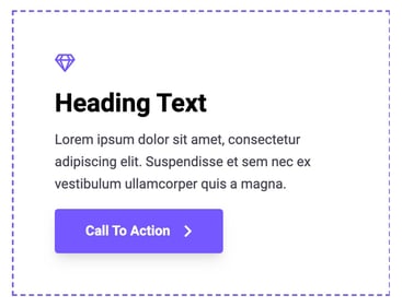
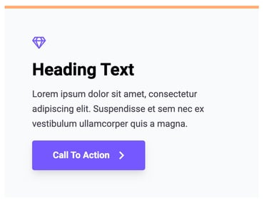
Instead of building one module as one static layout or style, all Hatch modules have their own Appearance setting. Each setting set is unique to that module, which means you can create hundreds of different design combinations from one module only.
To speed up your page creation process, Hatch modules come with 6 Prebuilt styles:
- None
- Border
- Box
- Card
- Card with Border
- Custom
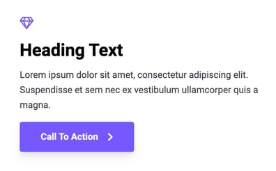
1. None
The module is displayed in its original layout without any appearance style including background, border, or shadow.
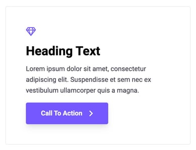
2. Border
Wrap the module with a thin border. Color can be customized under the Appearance > Border folder once the Prebuilt Style option is set to Border.
3. Box
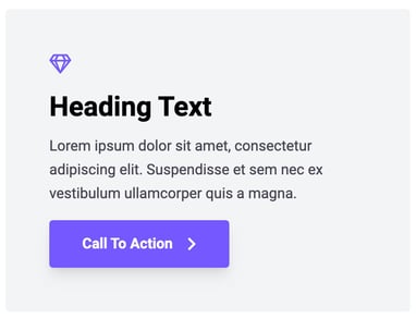
Wrap the module with a background color.
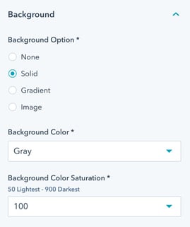
Once the option is selected, you can choose between Background Color, Image, or Gradient
4. Card
Similar to the Box prebuilt style, but Card has a shadow around the module.
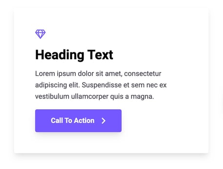
Once the option is selected, you can also choose between Background Color, Image, or Gradient

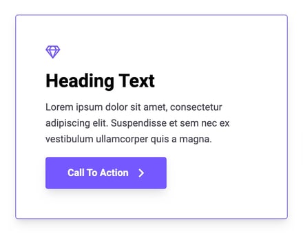
5. Card with Border
A combination of Card and Border prebuilt styles.
Once enabled, you can customize both background and border options.
6. Custom
Looking to build your own module design/appearance? No problem!
Select Custom, and you can customize it to the fullest including:
- Background
- Border
- Border Radius
- Shadow
- Padding
How custom can we achieve? Here are some ideas:
